How much sand has arrived (and where is it)
One of the benefits of undertaking that enormous analysis of the LiDAR data is that its now possible to examine the changes to the beach in huge detail.
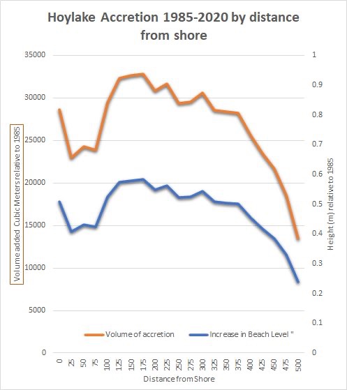
- You can see from the first graph that the highest build-up of and isn’t close to the promenade – it’s 100-200m out on the beach. This explains why it’s no longer a muddy slippery, impassable quagmire out there – that’s under close to a meter of fresh sand
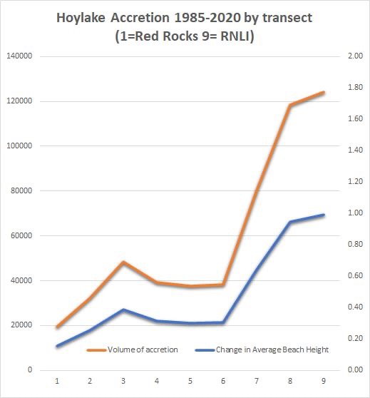
- The second graph shows build-up is much greater at the RNLI end of the beach (and this isn’t the effect of the old baths – it has happened out way past them too).
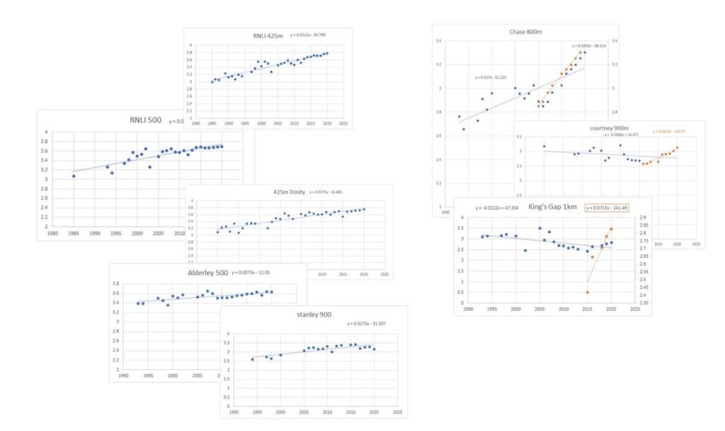
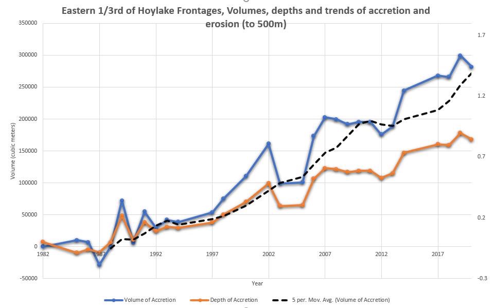
- Looking at the profiles of different locations over time, the areas which are accreting are mostly accreting at a steady rate i.e. the changes we have seen are still going on and the beach is getting higher and higher
- HOWEVER there are locations (currently in the model as linear projections based on accretion 1985-2020 that actually fit better as passing a tipping point and now are accreting much more rapidly. This means there might actually already be a lot more sand arriving now, and the rate of delivery is accelerating. These are further out on the beach and may well be a foretaste of things to come.